
How to Choose Brand Photos From Your Shoot
(From the Designer Who Has to Use Them)
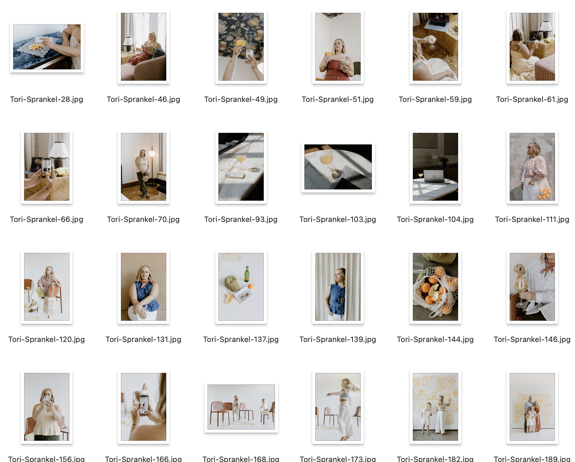
Your photographer just delivered the gallery.
Three hundred photos. All of them beautiful. All of them technically you. And now you have to pick the ones that are going to live on your website homepage, your services page, your about page, your Instagram grid, your social templates, and your email header — for probably the next two years.
Most people do this by picking their favorites. The ones where they look the thinnest. The ones where their hair turned out. The ones that got the most fire emojis in the photographer’s delivery email.
And then they send those photos to their designer (or open Canva) and immediately run into a wall. The photo that looked gorgeous in the gallery has no room for text. The one they love most is vertical when they desperately need a horizontal. The hero image is stunning but the background is so busy it fights with everything placed on top of it.
Here’s the thing: your photographer’s job is to take beautiful photos. Your designer’s job is to use them strategically. And those are two completely different jobs.
I’ve been the designer on the receiving end of brand photo galleries more times than I can count. I’ve also been on set — literally at the shoot — helping direct what gets captured so that when the gallery comes back, we have exactly what we need. So when I tell you there’s a better way to choose photos from your shoot, I’m telling you from the side of the process most people never see.
What It Looks Like When It’s Done Right: The Madison Dearly Project
One of my favorite examples of brand photography done at every level is Madison Dearly Financial — an accountant and tax professional for creatives who I worked with from the very beginning of her rebrand.
I didn’t just show up to design the website after the photos came in. I helped plan the shoot, was on site the day of (and shot b-roll footage for social and web use while I was there), and then after the photographer — the incredibly talented KaS at The Humble Lion — delivered the gallery, I sat down with Madison and we narrowed 300+ images down to 35–40 that could actually be used across her site and social.
That selection process wasn’t about which photos were the prettiest. It was about which photos had what each specific placement needed: horizontal shots for web heroes, vertical shots for mobile and social, images with intentional white space for text overlays, photos that communicated the right feeling for each page — her homepage, her services page, her about page, her offer pages.
The result is a site that feels cohesive from top to bottom because every image was chosen with a purpose, not a preference.
Want to see the finished project?
View the Madison Dearly Financial case study here →
(And yes, I loved KaS’s work so much I hired her for my own brand shoot a few months later — those are the photos you see on my own site now.)

What a Designer Actually Looks for in a Brand Photo for your Site
Before you open your gallery and start picking, here’s what to train your eye on. These are the things I’m looking for when I sit down with a client’s photos:
1. Negative space (room for text to breathe)
This is the single most underrated quality in a brand photo and the one most people ignore entirely. Negative space — the empty area around or beside your subject — is where text, logos, and design elements live on a finished page.
A photo where you’re centered, filling the full frame, is beautiful. It is also almost impossible to use as a website hero or a social graphic with text overlay. A photo where there’s open space to one side, above, or below you? That’s a working photo.
What to look for: can I see where a headline would go? Is there sky, wall, or open background somewhere in this frame?
2. Orientation: horizontal vs. vertical
Website heroes are almost always horizontal (wide, landscape format). Instagram feed posts are square or vertical. Stories and reels are fully vertical. Pinterest pins are vertical. If your entire gallery came back as beautifully composed vertical portraits, you may be missing the shots your website actually needs.
This is why talking to your photographer before the shoot — or having your designer involved in the planning — matters. You need both. Always.
What to look for: sort your selects into horizontal and vertical piles early. Make sure you have both before you get too far into selection.
3. Variety of distances: wide, mid, close
Wide shots give context and environment. Mid shots show personality and approachability. Close crops show expression and detail. All three serve different design needs.
Wide shots: website hero images, full-page backgrounds, lifestyle section headers
Mid shots: about pages, service pages, social carousels, email headers
Close crops: testimonial sections, pull quotes, headshot usage, profile photos
If you have 50 mid-distance photos and no wide shots, half your website is going to feel repetitive. Variety of distance is variety of utility.
4. Background simplicity
Busy backgrounds fight with overlaid text, brand colors, and design elements. A photo taken in front of a wall of exposed brick, a lush floral arrangement, or a heavily patterned backdrop is gorgeous on its own — and genuinely difficult to design around.
Simple, clean, or softly blurred backgrounds make your subject the hero and give design the room it needs to do its job. This doesn’t mean boring — a warm linen texture, a soft window-lit wall, an out-of-focus outdoor scene can all be simple without being sterile.
What to look for: if you put a text block over this photo, would it be readable? Would it compete or complement?
5. Tonal consistency across your selects
This one is easy to miss when you’re looking at photos individually, and obvious when you see them all together on a website. If half your selected photos are warm and golden and the other half are cool and slightly blue, your site is going to feel disjointed even if every individual photo is beautiful.
Your final selected gallery should feel like it came from the same day, the same world, the same person. When you’re narrowing down, look at your selects together — not just each one on its own.
How to Sort Your Gallery Before You Pick Anything
Don’t start with favorites. Start with function. Here’s the process I walk through with clients:
Step 1: Create three folders
Website: photos that have the technical qualities for web use — negative space, mostly horizontal, clean backgrounds, variety of distances
Social: photos that are personality-forward, can be tighter crops, feel candid and real — these are your Instagram and content photos
Archive: beautiful photos that don’t have an obvious home right now but might be useful later. Don’t delete them.
Step 2: Fill the website folder by page
Before you pick anything for the website folder, write down the pages your site has and what each one needs:
Homepage hero: horizontal, negative space for headline text, strong first impression shot
About page: mid-distance, warm and personal, can be more expressive — this is where people decide if they like you
Services pages: one strong image per service, ideally showing you in context of that work
Offer/sales page heroes: horizontal where possible, enough space for a headline and subtext overlay
Footer or section backgrounds: wide shots, clean or blurred backgrounds, can be used as full-bleed
Work through the gallery asking: do I have at least one good option for each of these? Fill the gaps before you add extras.
Step 3: Fill the social folder by content type
Profile photo: clean background, mid-distance, feels like you on your best day
Feed posts: personality-forward, variety of expressions, some candid-feeling shots
Story/reel covers: vertical, strong subject, can work with text overlay
Template inserts: photos that can drop into a Canva template frame — usually square-ish crops that work at any size
The Five Shots Every Personal Brand Actually Needs
If you’re planning a shoot (or reviewing whether your current gallery has everything), here’s the shortlist I use with every client. These are the five types of shots that get used over and over again:
The hero shot. You, looking toward or slightly away from camera, with room on at least one side for text. Horizontal if possible. This is your homepage. You need 2–3 strong options, not just one.
The at-work shot. (no laptop required - be different!) You doing your actual thing — at your desk, with your laptop, on a call, working with a client. Clients want to see you in your element before they hire you. This photo does that before you say a word.
The personality shot. Fav bev in hand. Mid-laugh. Walking. Off-guard feeling. This is your Instagram. This is the shot that makes you a person instead of a brand account. It’s often the one you almost don’t pick because it feels “too casual” — pick it anyway.
The detail shots. Your workspace, your tools, the objects that live in your aesthetic world. These fill content calendar gaps, add texture to your website, and work beautifully as supporting images in blog posts and email headers.
The clean-background shot. At least one photo with a simple, uncluttered background. You will need it for a graphic at some point. A quote card, a testimonial block, a social template. Everyone does. Get it before you’re hunting for it.
What to Send Your Photographer Before the Shoot
The best brand photography starts before the camera comes out. When I work with clients on shoot planning, I send the client or photographer a full creative direction brief that covers:
The overall mood and feeling the brand needs to communicate
Specific shot types needed (and which ones need to be horizontal vs. vertical)
Locations that fit the brand aesthetic
Wardrobe direction tied to the brand color palette
What the brand is specifically not — the poses, vibes, and references to avoid
How these photos will be used: website pages, social content, potential future pivots
⚠️ That last one matters more than most people realize. If your brand might evolve — if you’re a real estate agent who might pivot toward lifestyle content, or a financial professional who wants to bring more personality into her feed over time — your shoot should capture photos that will still work in that future version, not just the current one.
The Mistakes I See Most Often (and How to Avoid Them)
Picking the photos where you look best instead of the ones that work best
This is the big one. The photo where you look the thinnest, your hair is perfect, and the light is catching your highlights just right — but you’re dead center in the frame with no negative space and a busy background — is going to make your designer’s life very difficult. The goal is a gallery that works, not a gallery that flatters.
Skipping the “boring” detail shots
The close-up of your laptop. The coffee cup on your desk. The stack of notebooks. These feel unimportant in the gallery because they don’t have you in them. They are among the most-used photos in any final website, because they fill section backgrounds, email headers, blog post feature images, and social content without needing to be cropped or resized.
Not testing photos with your brand colors before committing
A photo can look perfect on its own and actively fight your brand palette when placed together. Before you finalize your website selects, open Canva, drop your top hero candidates onto a canvas with your brand colors, and see what happens. You’ll often find that the photo you almost didn’t pick is the one that makes everything sing.
Ignoring horizontal shots because you prefer vertical
Most people naturally prefer how they look in vertical portraits — there’s more of you, the framing is more flattering, it feels more intentional. But website hero sections almost always need width. Force yourself to find at least 3–5 horizontal options you love before you close the gallery.
Your Brand Photo Selection Checklist
Run through this before you send anything to a designer or start building in Canva:
Technical
At least 3–5 horizontal shots with strong negative space (for website heroes)
Variety of distances: at least one wide, several mid, a few close crops
At least one clean-background shot
Tonal consistency across selects (warm vs. cool, edit style)
Photos tested against brand colors in Canva
By placement
Homepage hero: 2–3 strong options identified
About page: 1–2 warm, personal, mid-distance options
Services/offer pages: 1 strong option per page
Social folder filled with personality-forward, candid-feeling shots
Detail/lifestyle shots in archive for content fill
The five must-haves
Hero shot (horizontal, negative space, 2–3 options)
At-work shot
Personality/candid shot
Detail shots (workspace, objects, texture)
Clean-background shot

PUT THOSE NEW BRAND PHOTOS TO WORK! GET MY FREE IG TEMPLATESI’ve got the canva pack of Instagram templates for you! It includes mix and match carousel layouts to make endless posts… plus a video tutorial walking you through setup.
Once Your Photos Are Sorted: Put Them to Work
The best brand photos in the world sit in a folder doing nothing if you don’t have a system to actually use them. For social content specifically, the fastest way to start using your new photos is to have templates that are already sized, styled, and ready for your images to drop into.
The free Instagram Canva templates were built with this in mind — photo-forward layouts designed for the kind of real, personality-led content that personal brands run on. Monthly recaps, lifestyle carousels, behind-the-scenes moments. Drop your new brand photos in, apply your brand kit, and your grid can look like a completely different account by the end of the week.
They come with a brand kit setup tutorial from me so your colors and fonts are consistent across every template — which means your gorgeous new photos aren’t fighting a mismatched visual system. Everything works together.
→ Download the free Canva templates here — and actually use those photos you just spent a day shooting.

Ready to finally go all-in on your brand and web?
Let’s do it!
I’ve developed lots of brand support options just for you. No matter what part of the branding journey you’re in, we should find a fit. From Brands-in-a-Day to Web and Social Media Design, I work in lightning-fast turn around to get you out the door and on your way to being your industry’s Go-To Girlie.

Grab your FREE Showit Link in Bio Page Set →
A completely (and quickly) customizable, high-converting Showit Page Duo to make your brand look professional, legit, and ready for clients, all from one link. If you’re running a business from your phone, you need one simple page that makes it easy for people to book you, buy from you, or connect with you—without the overwhelm of building a full website (yet).

Grab these FREE Instagram Canva Templates →
Ready to turn your boring “always selling” posts into a delicious, bingeable mix of business and pleasure? (I call this “my soft pretzel".) These templates are perfectly curated to help you create your soft pretzel life monthly recaps and personal brand posts that low key sells, and high key connects with your community.